Before diving into the concepts and importance of applying them to the web, it is necessary to understand accessibility as the ability to design products or experiences that can be used by everyone, regardless of their conditions or disabilities.
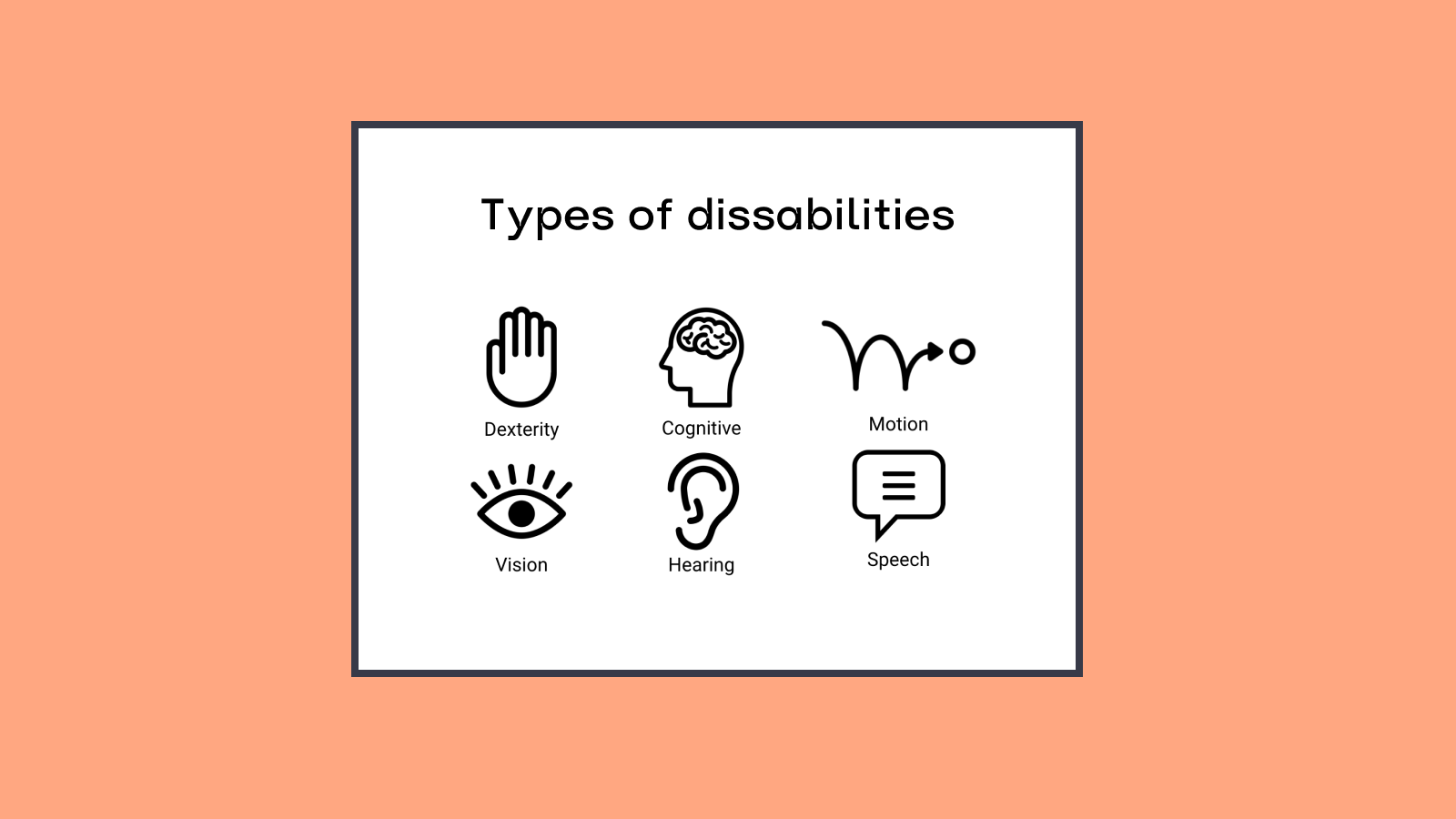
There are different types of disabilities: related to dexterity, cognitive, movement, vision, hearing or speech.

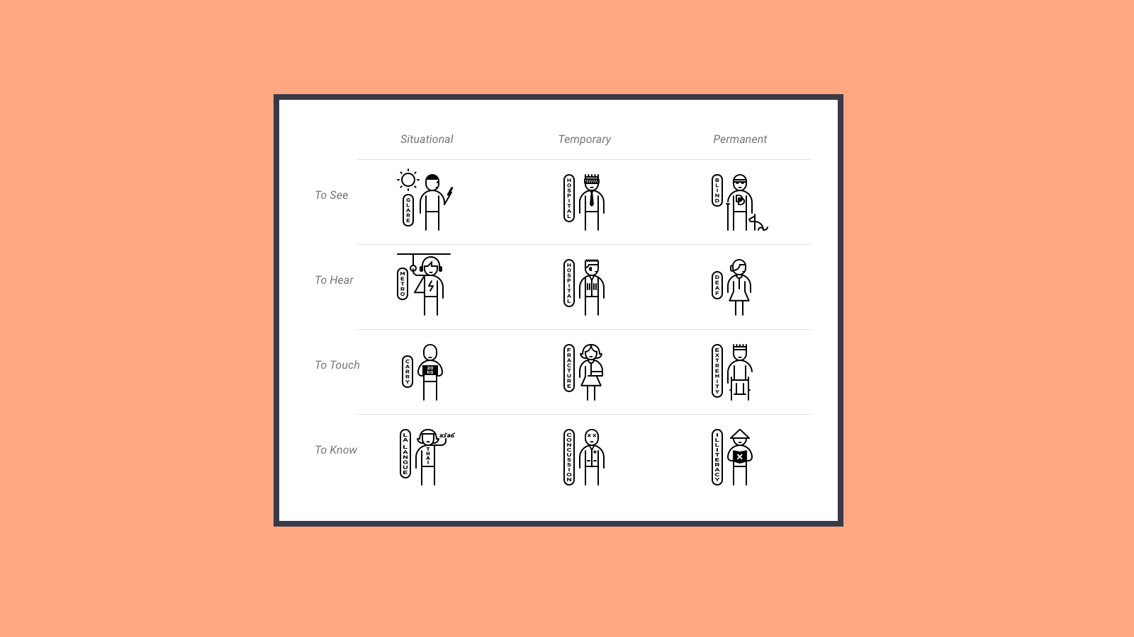
In addition, these disabilities may not be permanent, so anyone can become temporarily disabled, depending on the environment or situation.

For example, trying to read a screen in full sunlight can cause us a visual impairment such as not allowing us to see it properly.
Why is web accessibility important?
- Improves user experience: An accessible website allows all users, regardless of their abilities, to access and interact with content effectively.
- Expands our audience: By ensuring web accessibility, we can reach a wider and more diverse audience, including people with disabilities who may have been ignored on other websites.
- Improves our brand perception: By showing our commitment to inclusion and diversity, we can improve our brand image and build our online reputation.
- Improves SEO ranking: Search engines like Google value accessible websites as this improves the user’s ability to interact with the content.
What should be considered for a website to be accessible?
Achieving the highest level of accessibility (called AAA by the WCAG 2.1 standard) can involve a lot of content review and adjustment, design, and programming. However, with some simple improvements, visible results can be achieved in a short time:
Provide text alternatives: All non-text content on the web, such as images, videos, or audios, should have a text version so that users with visual impairments can identify and understand them.
In the case of images, this involves offering alternative text with descriptions, in the case of audio, textual transcripts, and in the case of video, subtitles.
Improve color contrasts: It is important to ensure that web elements have a color that is sufficiently contrasted with the background or the element that contains them, so that users with color blindness or other visual problems can see them correctly.
Check element sizes: Buttons or other interactive elements should be of sufficient size to make them easily identifiable.
Ensure that everything that moves can be stopped: Animations or background videos are visually powerful elements that can make a difference in the design of a website. However, whenever possible, an option to stop them should be offered, as they can be problematic for people with cognitive problems.
What can I do if my website is not accessible?
If you want to ensure that an existing website meets accessibility standards, you need to start by conducting an audit that helps you understand what aspects can be improved.
This audit will help identify which content needs to be worked on, which elements need to be designed more accessibly, or which parts of the programming can be improved so that text readers or other assistive technologies can identify them correctly.
At Mortensen, we can help you identify the points of improvement for your website or app by conducting a complete accessibility audit. Shall we talk?

